Driving local discovery and reducing bounce rates for a multi-region lifestyle platform
Reducing navigation friction on GuidedBy using behavioral research and straightforward design principles.

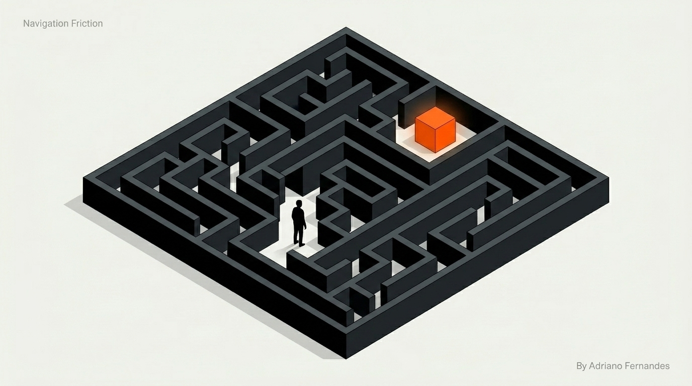
Navigation Friction
Glacier Media's product, GuidedBy, had a navigation problem. Users were landing on the homepage and getting lost because it was too hard to find local services relevant to their specific region. This friction caused high bounce rates, making local vendors invisible to the people they wanted to reach.
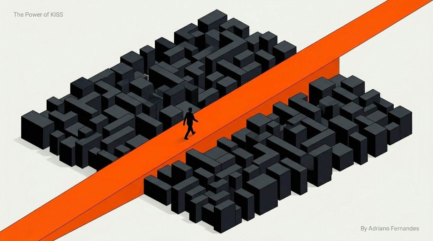
The Power of Simplicity
As the only UX designer on the team, I had to simplify the experience quickly. Working with developers and writers, we stripped the interface down to the essentials: a prominent search bar, a clear headline, and an obvious region selection tool. Every change was backed by user research. I wasn't designing for aesthetics; I was designing for utility.
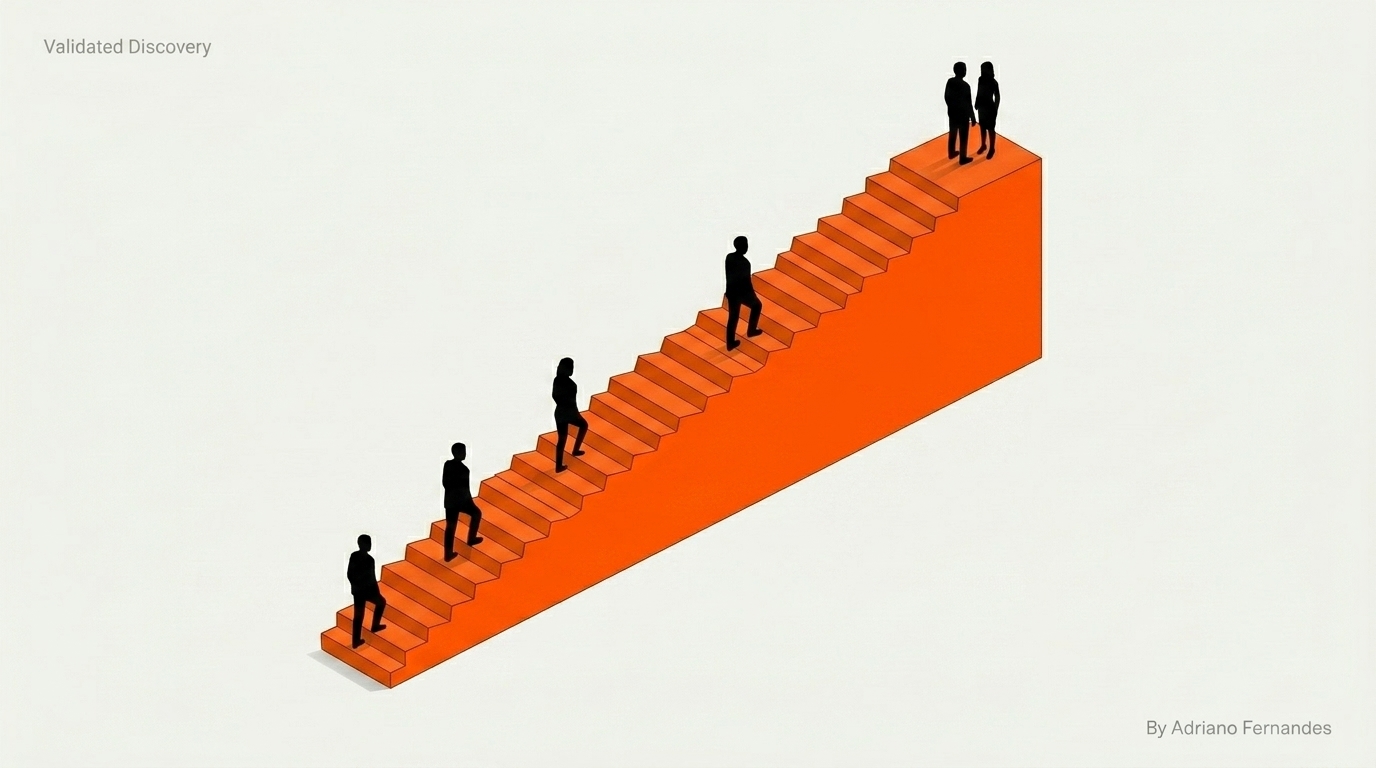
Validated Discovery
The data proved that simplifying the user journey works. Within the first quarter of the relaunch, the metrics showed clear improvement:
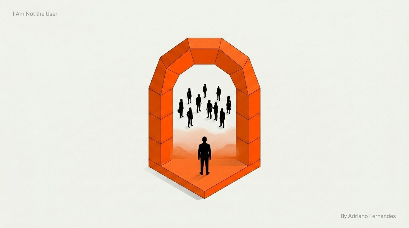
I Am Not the User
This project reminded me that my job isn't to build complex UI, but to build useful tools. I had sophisticated ideas for the interface, but the data showed users just wanted the basics to work without thinking about them. Removing my favorite design elements wasn't a loss; it was exactly what the platform needed to function properly for the community.