Improving the digital UX of a well-known restaurant franchise during an unprecedented crisis
Pivoting to a utility-focused design to keep online orders flowing during pandemic restrictions.

Pandemic Survival
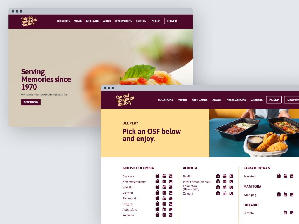
When pandemic restrictions started, the Old Spaghetti Factory Canada had to shift its entire business model overnight. The website wasn't built for a delivery-first reality. The navigation made it difficult to explore the menu and failed to transition users smoothly to delivery platforms. Their digital presence needed an immediate update.

Rapid Utility
Working alongside the design manager and developers, we had to move fast. We shifted focus from aesthetics to utility. I restructured the information architecture to put delivery and pickup options front and center using a clear grid layout. We optimized the navigation so users were only one or two taps away from placing an order the moment they landed on the site.

Keeping the Lights On
The launch helped maintain business continuity when foot traffic was paused:
Flexibility in Crisis
This project taught me that good design solves immediate problems. I had to let go of aesthetic ideals and focus purely on utility. It reinforced the idea that designers must be flexible enough to adjust their approach based on market conditions and the practical needs of the business.